November 20, 2017
Fabulously Cold With the Glacier Collection
Well I love Fall, but I would love it more if it wasn’t followed by Winter. Secretly, I have to admit though I do love Winter photos, so naturally I love the new Glacier Digital Kit.

There are so many great papers in this kit and with digital why choose just one? There is no bulk added when you add papers so layer as many as you like! Also, add I have enlarged the tree embellishments on the side to make a bit of a border. I changed the “Winter” title to white and then I added a texture to it to make it sparkle. Don’t forget to add your shadows to you elements.

On this page I skipped using the blue and focused on the natural colours in the kit. I also changed the saturation in my photos to dull down the bright red in my daughters sweater and hat. I also changed the colors of the blue jay, wonderland and frosty by decreasing the saturation. Shadows on your photos make them pop!
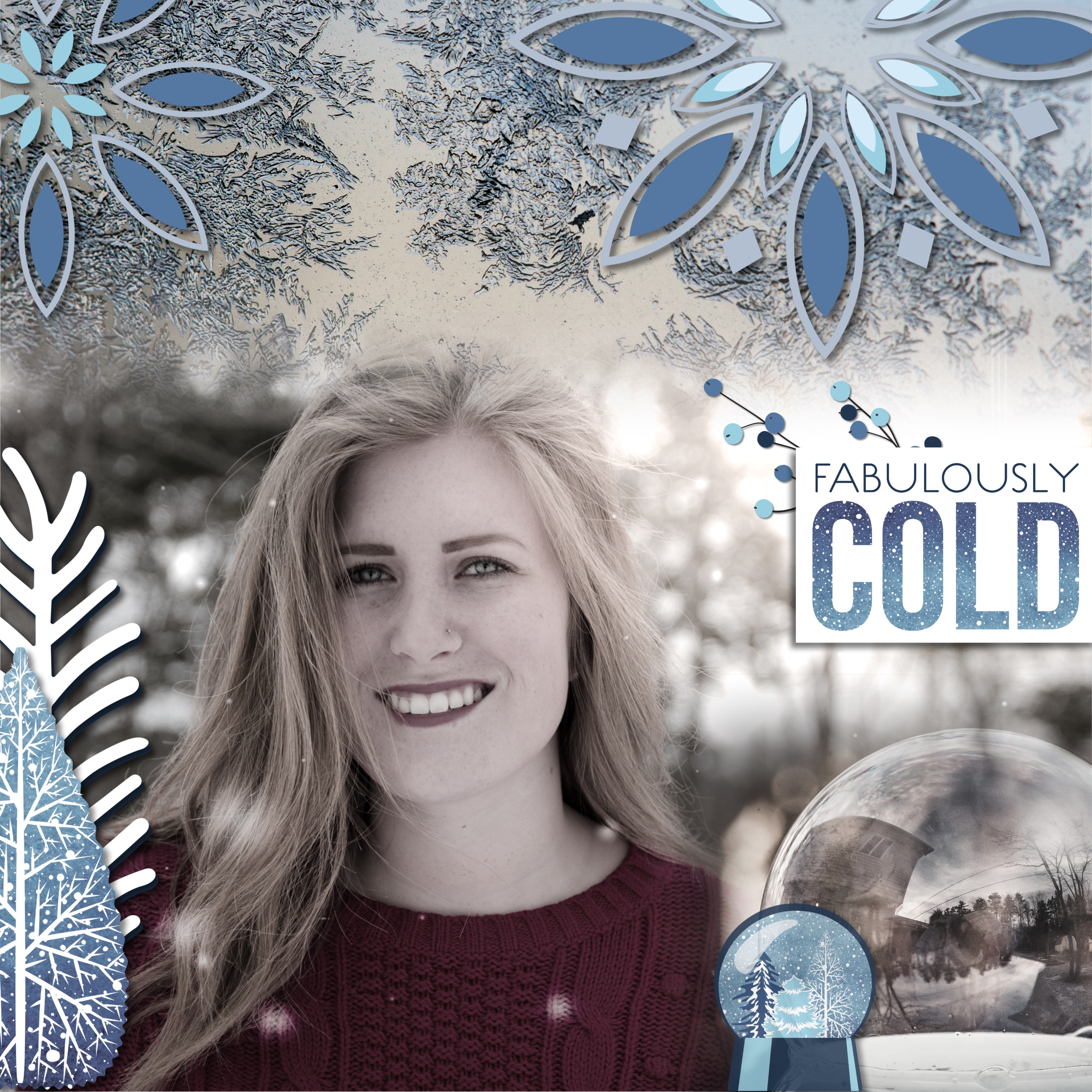
On this page I used my photos over the neutral border paper and I did a blended cut on each of them so they look like they are one photo. I added a few embellishments and layered large snowflakes over my snowflake photo. I added heavy shadows to all of the embellishments to give depth to my page.
Dress warm and go out and capture those winter memories!


Absolutely stunning. I would love to see a video on how you blended two photos to look as one.
Thanks for the tip about heavy shadowing. I tend to keep mine small–making the layout look a bit flat. What editing program do you use? I have PSE 15.
Thanks Barb! I use Artisan so I am not sure a video on blending would help as it is quite different than PSE. Shadowing makes a huge difference on a layout in digital.
Beautiful layouts. Great ideas
Thanks Lynne!