May 25, 2018
#FeatureFriday – Go Behind the Scenes with Super Duper’s Product Designer
Happy #FeatureFriday! Today, we’re going behind the scenes with CM Product Designer Tara to get the inside scoop on her design inspiration for the totally FUN-tastic Super Duper collection. You’ll also get some fun facts such as her favorite sticker, which collection was more fun to make (boy or girl?!), what she would change about the collection if she could and other insider details! Let’s check it out!
Meet the Designer

Tara has been an Illustrator and Product Designer with Creative Memories since December 2015. Other CM collections she has designed include Little Lamb, Imagine, Sugarplum, Bookworm, Fur Buddies, Go! Fight! Win!, Gallivant and more. Outside of work, she likes to be active. In the summer she can usually be seen on the lake wake-boarding. In the winter you can find her on the slopes snowboarding. Tara also enjoys cooking and is always looking for a way to make recipes with healthy alternatives so she can feel good about eating all that pizza.
What Inspired This Collection?
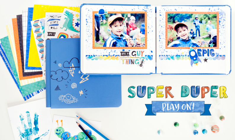
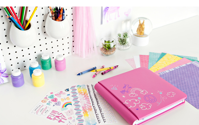
“This collection was inspired by popular kids’ fashion such as patches and trendy icons. Sassy and silly attitudes with bright colors.”

How Would You Describe the Palette?
“Bold and bright. It includes boisterous colors such as hot pinks, purples, electric blues, lightning bright yellow and orange.”
How Would You Describe the Papers?
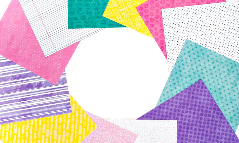
“The papers include staple patterns like polka dots, stripes and chevrons with a twist of messy, hand-drawn youthful styles. I wanted to incorporate trendy icons in a subtle way so they could be easy to use but also keep the silly and youthful feel. Kind of like what I used to doodle in my notebooks as a kid. Bold, trendy, messy fun!”

What is Unique About the Collection?
“This collection includes youthful hand-drawn patterns and icons. Half of the papers are generic enough to be used for any age or gender. I wanted Super Duper to appeal to the younger children as well as the preteens. I had to try and not go too kiddish or too teen.”

What was the Process for the Album Covers?
“We wanted to make sure to design a cover that incorporated our fun new patches, so that was the main consideration. I had five options for each, some were all-over patterns of icon doodles, some general patterns with dots and triangles and a paint splatter pattern. Ultimately, we chose the final because of how well the patch worked with the foil design.”

Which Collection Was More Fun to Create – Boy or Girl?
“They were both equally as fun, but if I HAD to pick I guess I would pick the boy. I’m not a super girly girl and I grew up with brothers and played with Teenage Mutant Ninja Turtles and trucks a lot!”

What Do You Envision This Collection Being Used For?
“Mostly for kids, ages elementary to adolescent! Also for birthdays, school, summer, adventures and theme parks.”

If You Could Change One Thing About This Collection, What Would it Be?
“More stickers! I feel like there are so many more cute and silly icons left to be created for this.”

What is Your Favorite Sticker?
“The heart pizza with heart pepperonis on the girl sticker sheet because it’s quirky and silly and I personally am in love with pizza!”
So, there’s a little insight from Tara! Comment below and tell us what you think of this fun collection!

I love this collection and I agree about the stickers!! ? You did a fantastic job on these two though.
Check out these products! Should I get this for Katy for her birthday instead of the bedspread?
Sent from my iPad
>
I would love to have patches available for all albums to use to personalizde/label them with names/dates, etc. on the spine!!
What a great idea for more patches
I love the patches, there beautiful. I’m a nurse by profession, could you make patches for us.