December 5, 2016
Painted Harvest Holiday Envelopes
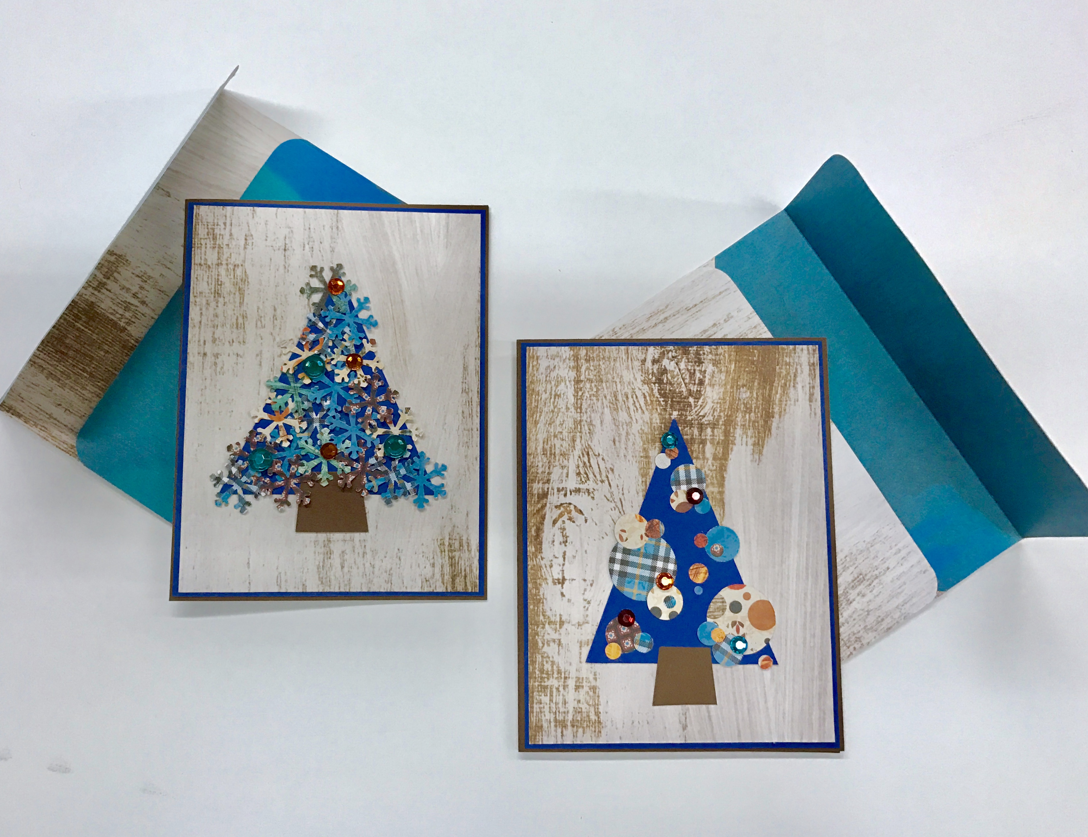
Nothing makes me happier than using up my scrap paper to put together a card/envelope duo that is going to make a loved one’s day. Last week I shared with you some super fun and simple cards that you could put together using the Painted Harvest collection. Today we are going to make some coordinating envelopes!
For the blog post on how to make the cards jump over HERE!

For instructions on how to make the envelope check out THIS blog from back in September. The instruction sheet can also be found in PDF form HERE.
And now the fun part… addressing your envelopes!
Did you have to read that twice? Do you think I’m crazy for loving this part of the process?!
I’m not crazy, I promise. I jut like to have fun with my envelopes because the way I see it is that if I’ve spent some time making a hand made card, I want the envelope to compliment the work I’ve already put in!
I’m going to share with you some tricks on how to make addressing your envelopes quick, fun, and super simple — but still beautiful!

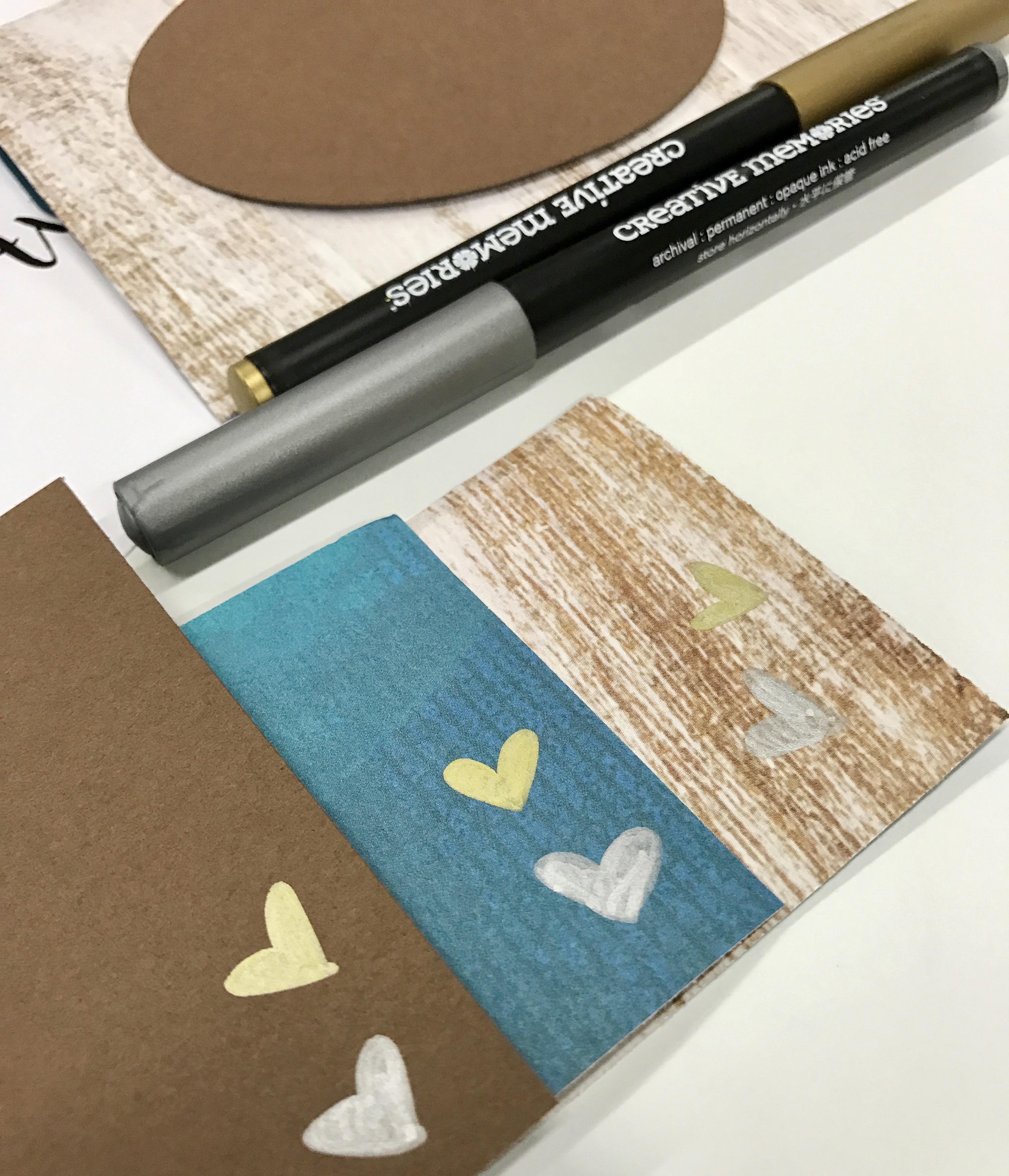
First, you’re going to pull out your supplies. You’ll need your cards and envelopes of course, but you’ll also need some pens, scrap paper, and some samples of fonts you like.
I decided that I wanted to use my Silver and Gold Metallic Pens to write my addresses in. Whether you’re using these or any other type of pen I would highly suggest taking a scrap piece of each of the papers you would like to write on and test out how easily it is to see the ink. You want to be sure that your cards are going to make it through the postal system – so it needs to be clear and easy to read. You’ll notice that both the gold and silver aren’t nearly as easy to read on the wood-grain patterned paper as they are on the blue patterned paper or the brown cardstock below.
The internet is FULL of free fonts in all different styles. All you need to do is download a few that look fun to you and then print off a simple word processing document that has a few names and numbers on them in each font. You don’t need everything you’ll be writing to be pre-printed – you’ll just need a sample of each font to get you started.

I always start by penciling in my words before making it permanent with ink. Since I wouldn’t be able to see the ink on my wood-grain envelope I chose to cut an oval out of the Brown Cardstock and write my words on there. This has two benefits – firstly, like I mentioned, it’s easy to read! Secondly, cardstock has two sides, so if you make a mistake you can always flip it over and try again on the back – this is a much more simple fix than needing to create a whole new envelope!
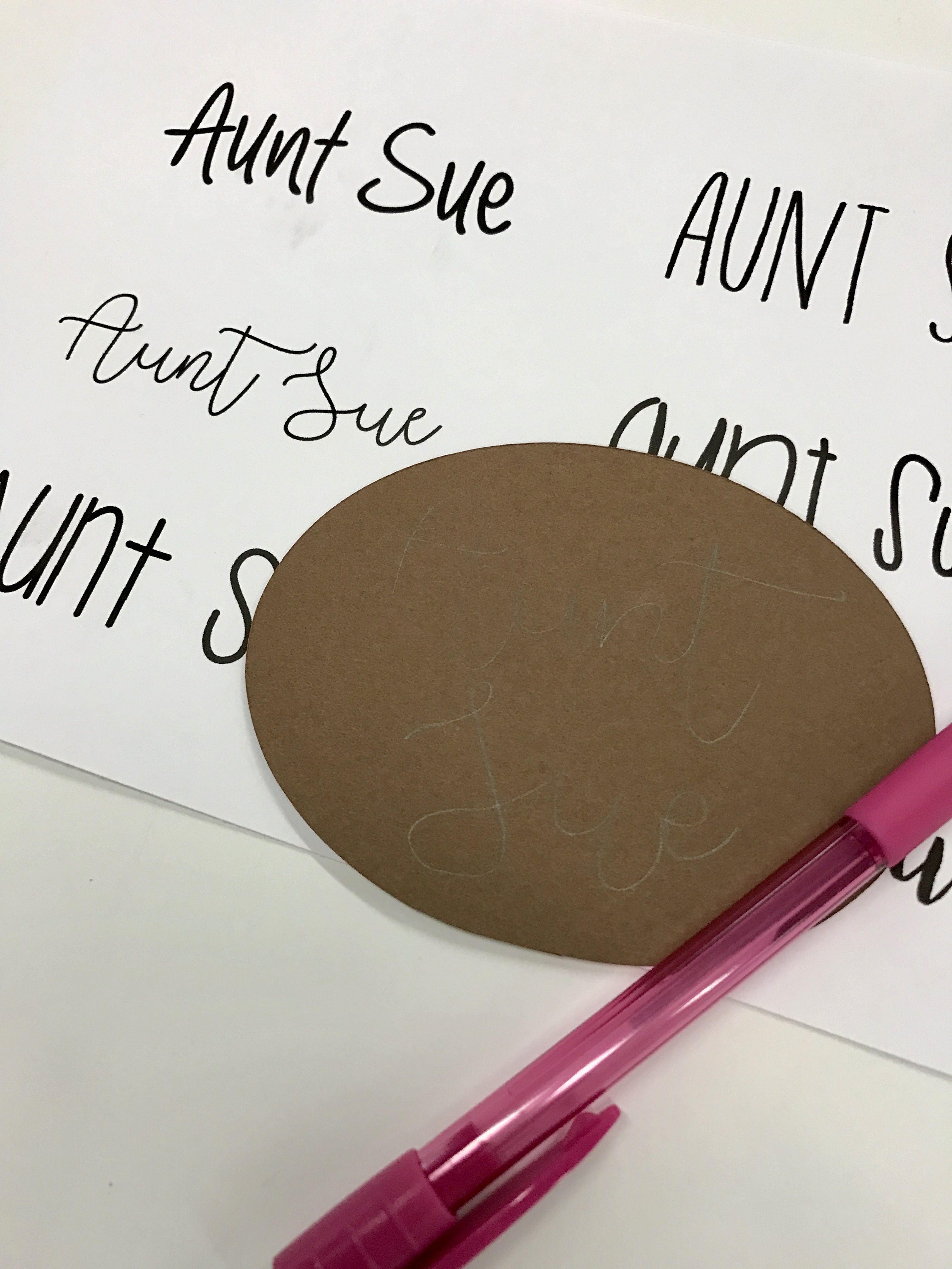
Once you’re happy with your pencilled script it’s time to take it to ink! Below you’ll see that I ended up modifying the letter “S” in Sue – that particular letter in the font I was following wasn’t agreeing with me – so I made it my own. The great thing is that Aunt Sue has no idea what that initial “S” looked like — never be afraid to put your own flair on things!

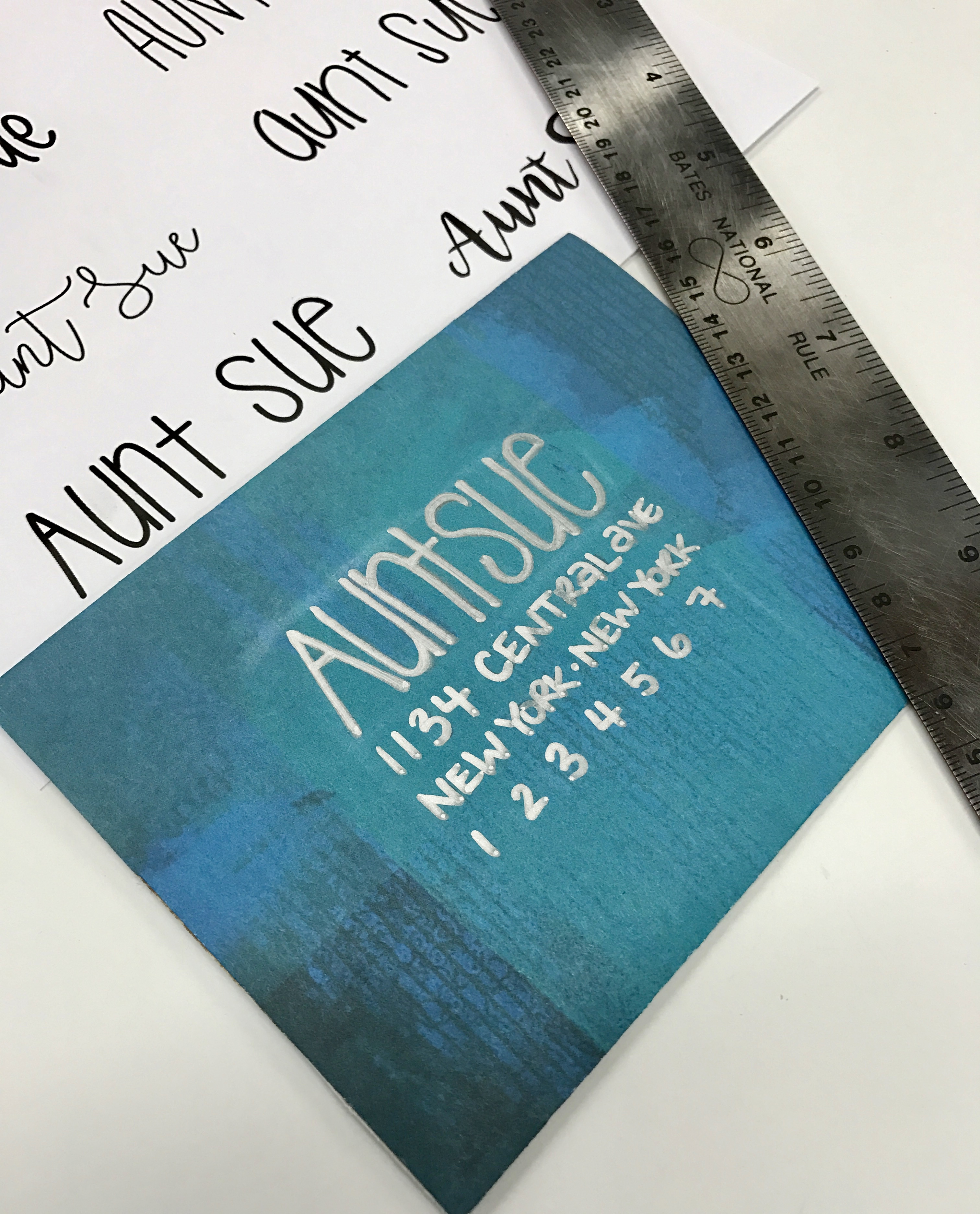
For my blue envelope I choose to write straight onto the envelope. This time I wanted to use the Silver Metallic Pen and I chose to follow one of the bubblier fonts instead of a scripty one like we did above.
I find it helpful to use a ruler and draw faint lines where I’d like my font to hit on the top and bottom – it helps it look much straighter!

When filling in the address information below, I try to keep my characters within the same row width so that it looks as though the name and address all fit within a rectangle (rather than the lines being all different lengths).
There are so many ways you can play around and have fun with addressing your envelopes. Who says this has to be the most boring part of sending a holiday card? Not me!

Enjoy spreading some holiday cheer to those you love this year with your handmade cards!
Take care,


[…] sure to check out THIS BLOG POST where I’ve shared how to make coordinating envelopes for these […]